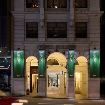
Lacoste evolves its visual identity, affirming its heritage through a contemporary expression shaped by a French elegance distinctive to the Maison.
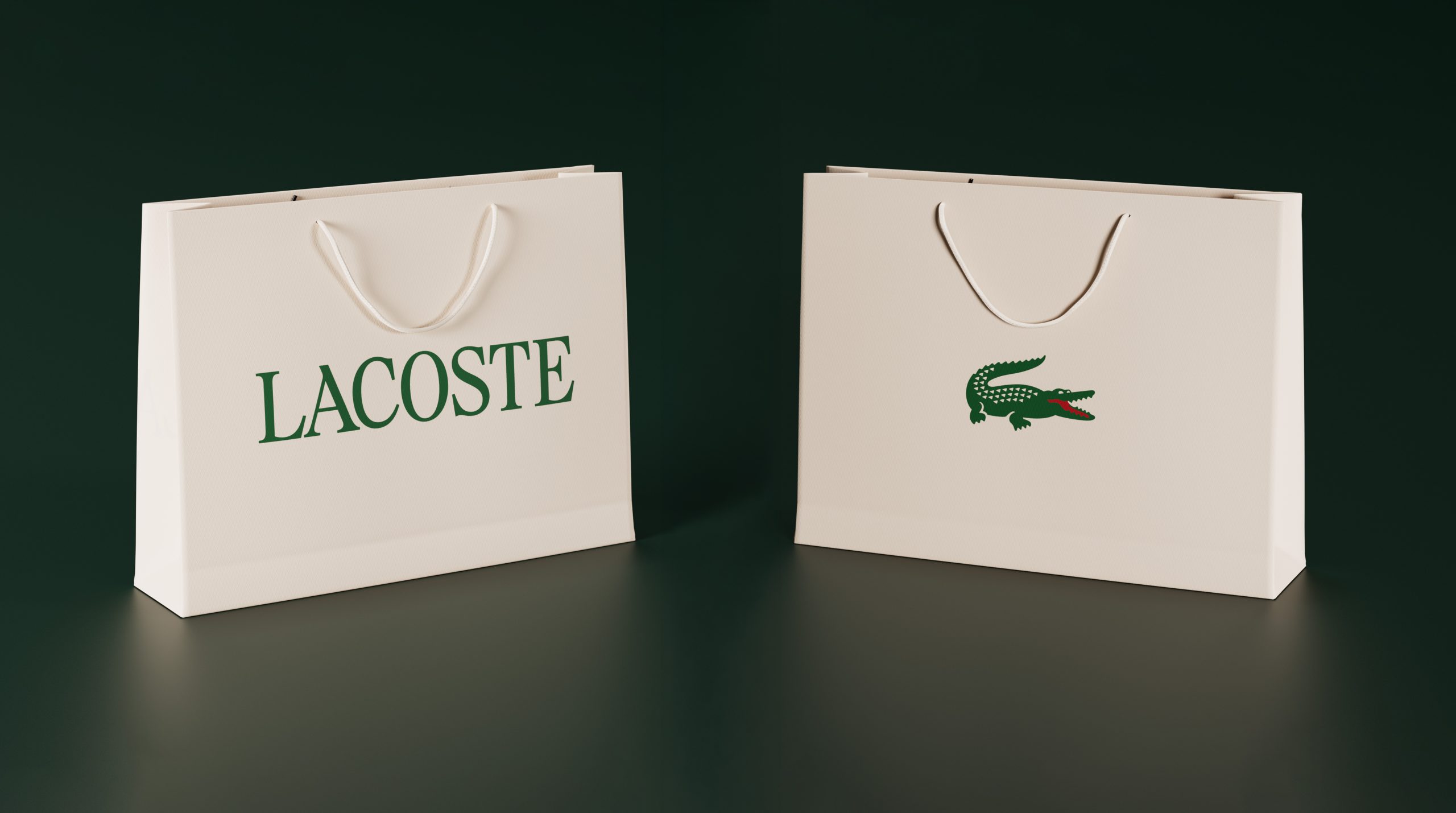
Typography stands as one of its structuring elements. Inspired by the Maison’s archives, it reintroduces a pronounced presence of serif characters, historically embedded in Lacoste’s expressions. Developed as a bespoke design, it is distinguished by the precision of its proportions, rhythms and spacing, asserting a signature that is both refined and distinctive.
Drawing on the richness of its archives, from the earliest creations of René Lacoste to the foundational work of Robert George, the illustrator behind the first Crocodile drawing, the Maison returns to its roots and to the codes that have shaped its identity, refining their uses to further assert its singularity.
The iconic Crocodile, emblem of the brand, is the subject of a considered approach to its uses, allowing it to be brought forward more prominently depending on context, particularly when used on its own. The red tongue, already present in the
original design, becomes more visible across certain expressions. It extends a historic detail while reflecting the spirit of freedom and playfulness that defines Lacoste.
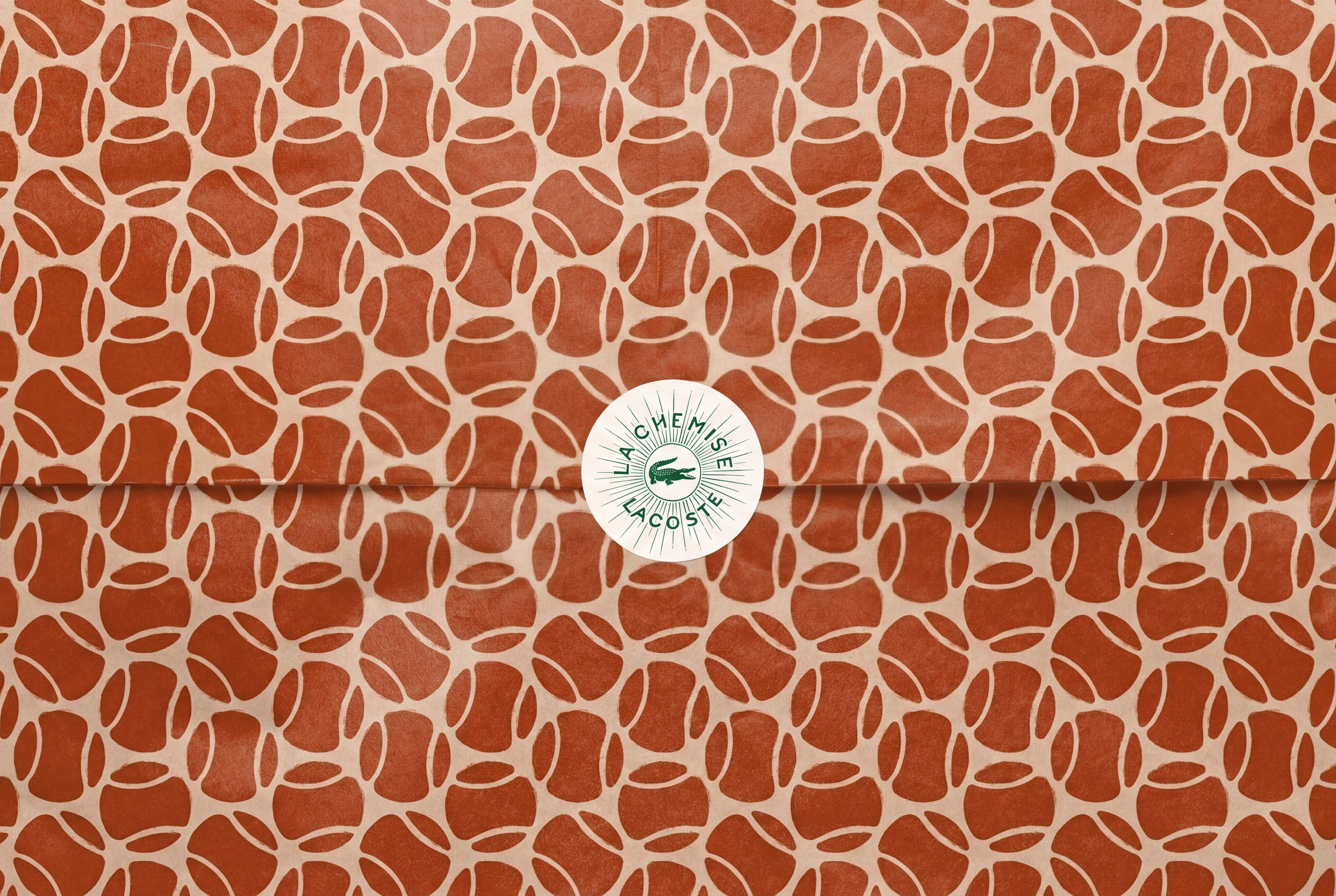
The Maison’s emblematic green has been adjusted to closely match its original shade, restoring an intensity true to the brand’s history.
René Lacoste’s handwritten script further enriches this visual language. Introduced in selected brand expressions, notably within the Café Lacoste logotype, it brings a more personal dimension, directly connected to the origins of the Maison. This visual language is further enriched by motifs inspired by the graphic archives, in line with the work of Robert George, and drawing from the brand’s territories and codes: tennis, golf and the Crocodile. These illustrations inform new expressions, particularly in packaging.
The colour palette places greater emphasis on the brand’s historic hues: green in three emblematic shades, alongside clay, echoing the clay courts and the world of tennis, and farine, a tribute to the off-white of René Lacoste’s first blazer. Colours and graphic codes are articulated within a cohesive approach designed to assert the brand’s expressions.
Developed in collaboration with Commission Studio, this visual identity will be progressively deployed across all brand expressions in the months to come. Through this evolution, Lacoste brings forward already iconic codes, offering a more assertive reading that reveals the full richness and singularity of the Maison.
Through this evolution, Lacoste brings forward already iconic codes, offering a more assertive reading that reveals the full richness and singularity of the Maison.


